When we catalog a book for the Charles M. Adams American
Trade Bindings Collection--or any other collection when we want to feature the
cover--we have two main challenges: a
fair representation of the binding design, endpapers, etc. through our
description, and trying to determine who designed the cover. Sometimes the latter is easy (when we know
the signature/monogram or the designer is identified in the book or from a
reference source), sometimes it is difficult, and, most often, it is
impossible. Though I don’t have exact
numbers on this, out of the approximately two hundred plus signatures and
monograms we know about, probably less than half have been identified, and far
more bindings are unsigned than signed.
So it’s doubly rewarding when we encounter a puzzle that is not too difficult to solve (reward 1), and
also gives a small glimpse into the life of an artist (reward 2). Such was an identification problem I faced some
time ago.
The book was an attractive title by
Laura E. Richards ,
one of six children of Julia Ward Howe and Samuel Gridley Howe. She was the author of around 90 books which
include Captain January and many other children’s books, biographies (including
a Pulitzer Prize-winning biography of Julia Ward Howe), and others. Its title was The Silver Crown: Another Book
of Fables (Little, Brown, and Co., 1906), and among the tree roots at the foot
of the cover was a monogram.


The monogram consists of a large “S”, a “W” within the
lower counter of the S, and a vertical line through the upper counter of the S
and possibly descending to the bottom curve and filling the apex of the W,
although this is hard to see without magnification. When enlarged the vertical line appears to
meet the apex of the W and follow the left stroke down. In addition, the W seems to be tipped
towards the right with the left vertex raised slightly above the curve of the
S. So we have a large S, a smaller W,
and possibly an I, or a J, or even a T with a rounded top. I was not familiar with any of these particular
combinations.
The question of the letters in the monogram was quickly
answered by the decorated title page which was clearly signed with a vertical
JWS.
But looking further into the book yielded an unexpected bounty: the book
contains 45 fables, each one beginning with a decorative initial. Of the 45 initials, 30 are monogrammed, plus the additional title page and cover monograms.
 What
was unusual was that nearly all of the monograms were variations of JWS in
different configurations, some with periods, some lacking a letter or two, some
in frames, most simple letters but a few overlapping, as with the cover
monogram. The ornamentation varies for
all of the letters, some reflecting the fable.
Here are several of the signed initials—it should be obvious which one
begins the fable called “The Serpent”! And see if you can spot the one which
begins “The Tangled Skein.”
What
was unusual was that nearly all of the monograms were variations of JWS in
different configurations, some with periods, some lacking a letter or two, some
in frames, most simple letters but a few overlapping, as with the cover
monogram. The ornamentation varies for
all of the letters, some reflecting the fable.
Here are several of the signed initials—it should be obvious which one
begins the fable called “The Serpent”! And see if you can spot the one which
begins “The Tangled Skein.”


To really get the feel of how this appears, here are all 30 monograms (not in page number order).
Of
course, cover designers, illustrators, and decorators are not bound to any one
form of signature or monogram (although some, such as Margaret Armstrong, used
a distinctive monogram from the beginning and kept it throughout their
careers). A case in point is the DecorativeDesigners, whose well known “DD” monogram with the second “D” reversed showed
many variations during their 30 year existence, from the Ds barely touching to
fully interlocked, and represented in any number of fonts. Other designers who used a variety of
monograms include Theodore Brown Hapgood, Amy Sacker (gathered by our own Mark Schumacher at his Amy Sacker website under
Sacker monograms), and
F. Berkeley Smith who variously signed bindings S, BS and FBS, with or without
a number of different frames, causing all manner of confusion between his covers and those of other designers with similar initials.
Still, 32
variations in one book seems just a little excessive!
Turning to the
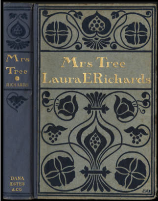
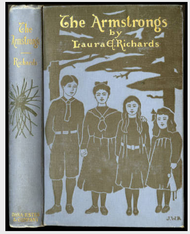
identity of the designer/decorator, I knew that Julia Ward Richards, Laura’s
daughter, had done binding designs and illustrations for several of her
mother’s books, five of which are pictured here.
... with their respective monograms.


The monograms looked very similar to those in The Silver Crown except for the final letter—the
arrangement, the spotty use of periods, even the style of some of the covers
were similar to certain initials in The Silver Crown. You've no doubt guessed by now what I found
when I checked the autobiography of Laura Richards. In the final chapter, “Milestones,” she says:
“In 1905 came the first milestone with an orange blossom laid on it. Julia
Ward, my mother’s namesake, married Carleton Anderson Shaw.” Our mystery designer was indeed Julia Ward
Richards, who was known after Dec. 27, 1905, when she was married at Gardiner,
Maine, variously as Julia Ward Shaw or Julia Ward Richards Shaw. In 1910 Nathan
Haskell Dole wrote of her: “Another daughter, Julia Ward Richards, now Mrs.
Carleton Shaw, has had similar success with her pencil. She has made a specialty of designing
book-covers, and in this way her work has been pleasantly associated with that
of her mother.”
I enjoy
speculating about just when Julia prepared the initials and cover for her
mother’s book. She was married on
December 27th and her mother’s book was listed as “published today”
in the October 13, 1906 Publisher’s Weekly, and was then listed in the “Weekly
Record of New Publications” in the October 20th issue. Did Julia work on the new monograms after her
marriage, in the ten months between that event and the publication of the
book? Or did she perhaps spend some time
before the end of December in designing the initials and working out how she
would sign them. To me, the monograms
seem to be more than just fitting a space in the initials. Whether real or not, there is a feeling of
trying things out—varying the letter shapes, seeing what looks good and where--about
them. This is particularly true of the
monograms with overlapping letters. Most
of these include the W in the upper counter of the S and do not seem fully
worked out. Throughout, there is a
playful feeling of experimentation with that new letter S. Only the cover monogram looks “finished”--or close
to it. Though her gravestone reads
“Julia Ward Richards” the Richards’ “R” is seen nowhere in this book.
And
there we will leave it. I have not seen any book covers or illustrations in books by Julia Ward Shaw after “The Silver
Crown” and if they exist I certainly don’t know if any are signed (although the cover of Laura Richards' 1907 book Grandmother certainly resembles Julia's work). Nathan Dole’s 1910 piece on Julia Ward Howe
quoted above does not make it clear if he is speaking about Julia in the
present or in the past. If any turn up
I’ll update this post; but as far as I know, the cover monogram on The Silver
Crown is the last by Julia Ward Shaw.
And it’s a good one.
The Silver Crown might be unique.
Though I've seen designers use a number of signatures and monograms over
time, I've never seen one so painstakingly—or playfully--working out a monogram
in a single place. Certainly not in such
a public one!
 |
| Julia Ward Richards Shaw |
 |
| Laura Elizabeth Richards |
Julia
Ward Richards Shaw was the 4th of Laura Elizabeth Howe’s and Henry
Richards’ seven children. She was born
in Gardiner, Maine on August 30, 1878, and died in Concord, Massachesetts on
June 18, 1977 at the age of 98. She was
buried at Groton, Massachusetts. She
married Carleton Anderson Shaw (born Lexington, Massachusetts, May 9, 1873,
died Groton, Massachusetts, February 4, 1937) in Gardiner, Maine on December 27,
1905. Carleton taught at the Lawrence
Academy, Groton, Massachusetts, for a year, then established the Red House School
in Groton where he was headmaster until his retirement in 1932. The Shaws had four children, Henry (born Nov.
17, 1906), Elizabeth (born Oct. 16, 1908), John Dyer (born July 29, 1911), and
Robert Hollowell (born July 20, 1914).
Sources:
Dole,
Nathan Haskell. “Julia Ward Howe and her
talented family.” Munsey’s Magazine, v.
42, no. 5, February 1910). P 619.
Website, viewed Mar. 20, 2015,
Harvard
Graduates’ Magazine, v. 14, no. 55, March 1906, p. 560. Website, viewed Mar.
23, 2015
Harvard
College Class of 1895. Fifth report. Cambridge: Printed for the class, June,
1915, p. 290-1. Website, viewed Mar. 23, 2015.
Publishers’
Weekly. Aug. 18, 1906 (no. 1803) p.
371. “Little, Brown & Co. have in
preparation…”
Publishers’
Weekly. Oct. 13, 1906 (no. 1811), p.
1027 “Little, Brown & Co. publish to-day … The Silver Crown,” by Laura E.
Richards, a book of fables for old and young”
Publishers’
Weekly. Oct. 20, 1906 (no. 1812), p.
1091. Listed in “Weekly Record of New
Publications” All viewed from website.
Richards,
Laura E. Stepping Westward. New
York: D. Appleton, 1931, p. 387.
Books shown:
Richards, Laura Elizabeth Howe. The silver crown: another book of fables. Boston: Little, Brown and Co., 1906.
Richards, Laura Elizabeth Howe. Geoffrey Strong. Boston: Dana Estes & Co., 1901.
Richards, Laura Elizabeth Howe. Mrs. Tree. Boston: Dana Estes & Co., 1902.
Richards, Laura Elizabeth Howe. The Merryweathers. Boston: Dana Estes & Co., 1904.
Richards, Laura Elizabeth Howe. Mrs. Tree's Will. Boston: Dana Estes & Co., 1905.
Richards, Laura Elizabeth Howe. The Armstrongs. Boston: Dana Estes & Co., 1905.


 The bindings weren't the only thing that carried over from book to book, the endpapers and title page designs were also reused in some instances. Most of the books (with the exception of a few such as The Prisoner of Mademoiselle) had the series endpapers that can be seen on the left. The three prominent visuals in red are two opened books towards the bottom and the Page printer's mark with the Latin motto "spe labor levis" which can be translated as "May the work be light" or "Hope lightens labor" or "The hope of light labor." The visuals in red are surrounded by a green garland and floral designs with a crown at the foot of the page.
 The bindings weren't the only thing that carried over from book to book, the endpapers and title page designs were also reused in some instances. Most of the books (with the exception of a few such as The Prisoner of Mademoiselle) had the series endpapers that can be seen on the left. The three prominent visuals in red are two opened books towards the bottom and the Page printer's mark with the Latin motto "spe labor levis" which can be translated as "May the work be light" or "Hope lightens labor" or "The hope of light labor." The visuals in red are surrounded by a green garland and floral designs with a crown at the foot of the page.