In the last post we began to look at cloth color as an aspect of trade binding design. We also took a brief look at publishing practices such as the role of electrotyping in keeping books available for long periods, and “case binding” and how this method of bookbinding allowed publishers to meet increased consumer demand quickly and economically. We examined several designs by two of the masters of trade binding design, Margaret Armstrong and Sarah Wyman Whitman, and why some books were published in differently colored cloth simultaneously--with John Greenleaf Whittier’s The Tent on the Beach issued in at least four different cloth colors. We saw how cloth color alone can vary a design’s impact, sometimes dramatically, and how the color of the cloth used was not random, but was made by choice of the designer and/or the publisher, to serve both the design and the book buying public’s preferences.


As promised, in this post we’ll look at the use of cloth color for “series” (or “editions”) of individual authors. Since there will be lots of bindings to look at I’ve decided to limit myself to two Margaret Armstrong series, each of which uses the same cloth color to define the series; the different (though related) designs on each book distinguishes the individual titles. With apologies for turning this topic into a saga, I’m now planning one or two more posts in this series. In the next post I’ll look at one of my favorite series. Since this one focuses on the use of one cloth color to “brand” an author, the next will examine how different cloth colors can complement designs for a single author series, by emphasizing the subject of each book. I’ll also return to the “and beyond” in the title of our blog by discussing how we represent cloth color when we prepare descriptions for bindings in our collection. A final post will focus on the concept of series as much as that of cloth color, with examples drawn from other Margaret Armstrong “series” in all their variety.
It seems appropriate to let a family member begin our consideration of Margaret Armstrong’s great series.
In his autobiography, Hamilton Armstrong, Margaret’s youngest brother, discusses his sister’s work in cover design:
In his autobiography, Hamilton Armstrong, Margaret’s youngest brother, discusses his sister’s work in cover design:
 |
| Hamilton Fish Armstrong |
And as always, when discussing Margaret Armstrong, we also turn to Charles Gullans’ and John Espey’s checklist, in which the two series are introduced:
“The two great series and the remembered are the twelve titles for Myrtle Reed from 1901-13, and the twelve in the blue cloth series of books by Henry van Dyke which stretched from 1901-27 … So highly individual are the semi-uniform bindings that she invented for her authors that, when she declined to do more work than interested her, the publisher frequently went to other artists who would design in the style she had established for the author. Scribner did this often for her authors … Putnam had also to go elsewhere when Miss Armstrong tired of the lavender cloth and the sentimentality of Myrtle Reed for the designers of The Myrtle Reed Year Book (1911) and A Woman’s Career (1914).”(2)

 |
| See note 3. |
Anyone at all familiar with American binding design of this period knows these two series and has probably seen most of them. I would guess that many people that frequent used book stores (whether physical or virtual) that stock books of this period have also seen one or more titles from these series. There are good reasons why these books are at least relatively common over a century after they were written, even though both authors, like so many others of a century ago, are regrettably (or mercifully) virtually forgotten today. Both Myrtle Reed (1874-1911) and Henry Van Dyke (1852-1933) were prolific. Although Reed’s first book was published in 1898, only 13 years before her untimely death, 27 books were published in her lifetime in addition to a number of posthumous volumes. She also wrote innumerable short pieces of fiction, poetry, and nonfiction, including columns in newspapers, under a variety of pseudonyms. Over his long life Van Dyke authored over 70 books and a vast number of periodical contributions of poetry, essays, and short stories. Both were extremely popular, with Reed’s titles regularly exceeding, sometimes greatly, 100,000 copies sold. And, of course, they also had the good fortune to have publishers who commissioned a series of bindings by Margaret Armstrong for their books. So a vast number of copies were produced (in the case of Myrtle Reed well over a million), and the books are very attractive, therefore more likely to be kept than perhaps more worthy but less eye-catching works.
We’ll begin our examination of Margaret Armstrong’s two great series with her designs for Putnam’s Myrtle Reed "lavender series," which began in 1901 (ultimately in 1899--you’ll see), and ended in 1913, two years after Reed’s death.
Now, for all those who have not had an opportunity to see the lavender (mostly) series, let’s take a look at the collected Armstrong/Reed bindings. We’ll also be taking a closer look at many of these designs, mostly in the context of Gullans’ and Espey’s “complications in variety and priority of bindings” which are summarized below. As you scroll through the images, consider the small number of colors that Margaret Armstrong used in constructing her designs: metallic gold or silver (one binding), and white, pink, dark purplish-red, and light green inks; and that the first 8 designs are composed using only gold and usually white.(4)
 |
| Love Letters of a Musician. New York: Putnam, 1899 (this copy 1912). |
 |
| Later Love Letters of a Musician. Putnam, 1900 (5th printing 1901). |
 |
| The Spinster Book. Putnam, 1901 (1911 printing). |
 |
| Lavender and Old Lace. Putnam, 1902 (1905 printing). |
 |
| The Master's Violin. Putnam, 1904. |
 |
| Atthe Sign of the Jack o’ Lantern. Putnam, 1905 (1907 printing). |
 |
| ASpinner in the Sun. Putnam, 1906 (1907 printing). |
 |
| LoveAffairs of Literary Men. Putnam, 1907 (2nd printing). |
 |
| Flowerof the Dusk. Putnam, 1908. |
 |
| OldRose and Silver. Putnam, 1909 (1910 printing) |
 |
| Masterof the vineyard. Putnam, 1910 (2nd printing). |
 |
| AWeaver of Dreams. Putnam, 1911. |
 |
| The White Shield. Putnam, 1912. |
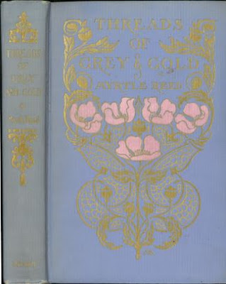 |
| Threads of Grey and Gold. Putnam, 1913 |
The careful observer has no doubt noticed that fourteen bindings are shown, not the twelve mentioned by Gullans, and there are indeed fourteen entries in his checklist. The reason for this is that two of the bindings have repeat designs with small variations. Later Love Letters of a Musician repeats the design of Love Letters… but with the addition of “Later”, of course. Gullans notes that the lettering for “Later” is not Armstrong’s; it does look a little different and the placement is certainly awkward with the word squished in between “Love” and the bottom of the ornamental frame. He also notes that the cloth color on the two “musician” titles is a pale gray, with The Spinster Book being the first to be issued in lavender cloth. The other title which Gullans lists but is not part of “the twelve” is Love Affairs of Literary Men (1907). In this case the cover design is almost the same as Lavender and Old Lace but with a different center panel, which thus merits an entry in the checklist but is not counted as a different design.(5)


Detail of the added word "Later" to Love Letters of a Musician and portion of the backstrip from the same binding design.


Portion of backstrip from the gray cloth binding of Love Letters of a Musician on left (Sept. 1901, 9th printing) on left and from a lavender cloth binding issue (from Oct. 1912) on right. The ornament on gray cloth matches that used on the Later Love Letters, but the ornament on the right is different and represents a later backstrip design. As a point of interest, note the contrast in brightness between the gold embossed design on the cover (below) and the ornaments and lettering on the spine in the full binding picture. The dullness of the spine ornaments is due to the use of “Dutch metal” (also called “Dutch gold”) rather than gold on the spine. Dutch metal is a copper and zinc alloy which is much cheaper than gold but tarnishes more or less rapidly depending on the environment, type of material on which it’s used, and the type of foil used.(6)

There are an additional two titles that were issued in lavender cloth. Both of these share the gilt outer portion of the design first used on Lavender and Old Lace and later on Love Affairs of Literary Men, with The Shadow of Victory using the central white portion of the design from Lavender..., and Happy Women the center design from Love Affairs... These also are not considered part of the 12 title lavender series by Gullans, but for the sake of completeness, here they are:
 |
| The Shadow of Victory. Putnam, 1903 (1911 printing). |
 |
| Happy Women. Putnam, 1913 (published posthumously) |
A contemporary critical essay on American bookbinding was published in 1900 as part of a special number of the Studio, an English journal, on modern bookbinding. This is an important publication in that a number of bindings are identified by designer. The author, Edward Fairbrother Strange, begins by stating that five or six years before (about 1895), “it was possible for the Americans—looking chiefly at a few delightful examples … to claim that they were well in advance of the productions of any other country.” But no longer! He goes on to state:
Whether the falling off—for there is one—is due to the apathy of publishers, or to lack of skill on the part of artists, is a question that can hardly be discussed in an essay dealing with the general aspect of the case. But after a careful review of the principal book-covers produced during the last few years in the United States, I am driven to the conclusion that no progress has been made, that the designs, when not comparatively feeble and ineffective, are imitative of work done on this side of the Atlantic; and that the typical examples selected for the illustration of this essay compare somewhat unfavourably with those in the reviews of similar designs by artists of British and other nationalities, which accompany it.

OUCH!
But some designs apparently weren’t as bad as others—and one of those he singles out for praise is Margaret Armstrong’s first Reed design. He also makes, I think, the quite reasonable point that publishers should allow the designer’s monogram on her or his work:
Another allusive—if we may borrow the word—book-cover has been made by Margaret Armstrong for Love-letters of a Musician. It is good in colour, the rare subordination of the two lines of floral diaper giving a pleasing effect, but the head of St. Cecilia, done on an inlay of vellum in slight relief, and the border of gold which surrounds it, seem rather forced and over-wrought. This portion of the decoration would have been better if it had been carried out in colours harmonizing more with those of the ground. It is pleasant to note that this cover bears the monogram of the designer, for the importance of signed handicraft-work cannot be insisted on too strongly or too frequently. [Amen, brother Strange!!] We congratulate both the artist and her publishers on the breadth of view that permits so simple and reasonable a piece of straight dealing.(7)
If only publishers had paid attention, our lives would be less frustrating!
In their introduction to the grouping of Reed titles in their checklist, Gullans and Espey spend almost two pages on the complications in variety and priority of the bindings.(8) These fall into two categories: the ornamentation of the backstrips, and the types of binding materials and coverings (boxes and dust jackets). Even on specific titles both of these sometimes evolved over the fifteen year duration of the series, and with the popularity of the author and resultant multiple printings it’s often difficult to tell just what came when. As we hold a number of titles in later printings and I have not studied multiple copies and printings, the most I can do is to repeat their conclusions on the two topics. There was a variety of lettering and ornaments on the spines as can be seen by browsing through the images; but with the fifth title, The Master’s Violin, a “standard backstrip” was established.


On the left is Gullans and Espey's standard backstrip, with top ornament, dot-and-line, title, central flower and leaf ornament, author's full name, dot-and-line, and bottom ornament. On right, one of our copies of the first title to use this combination is a double variant as it is on gray, not lavender, cloth, and has the variant backstrip with three rules and a non-canon (i.e. not by Armstong) gladiolus.
Gullans and Espey further state that all of the titles, with the exception of The Spinster Book, Love Affairs of Literary Men, and Threads of Grey and Gold, were originally or eventually issued with this backstrip. As you can see below, the information is partly out of date, as even our rather modest collection of Myrtle Reed titles partly disproves this claim as our 1911 printing of The Spinster Book (below left) has the full backstrip in all its glory. The backstrip from Love Affairs of Literary Men is below, center; Threads of Gray and Gold's backstrip appears at the right, with the tiny variant that excludes it from the roster of standard backstrips (a single dotted cross above the flower and leaf ornament).


I’ve noted with interest that Putnam seemed to have a fondness for this spine ornamentation--or perhaps the dies for it were just available and, therefore, cheap--and did not confine the standard backstrip, or some variant of it, only to Myrtle Reed titles. In 1908 they published Goldsmith’s Vicar of Wakefield with exactly the same spine ornamentation as Reed’s 1905 At the Sign of the Jack o’ Lantern. And there is no reason to think that this was the only binding decorated in this way, as the cover design reminds me of many other “series” style bindings, often for reprints of literary classics, with its ornamental oval frame enclosing the title and dot-and-floret border.


The second group of “complications in variety and priority of bindings” analyzed by Gullans and Espey are not evident from the illustrations above, as all of those are in lavender or gray cloth issues. To summarize the difficulties, Putnam issued the first three titles in cloth only. The fourth, Lavender and Old Lace, was issued in cloth or full leather (in box). The next year (1903) the first and fourth were issued in four bindings, cloth, antique calf (9), red leather, and lavender silk cloth, while the second and third were issued in the first three bindings only. The following year, The Masters Violin was issued in all four bindings when first published, as were all subsequent titles in the series as they were published.
 |
| From Publishers Weekly, Jan. 31, 1903 |
 |
| Ad for The Master's Violin, from Publishers Weekly, Oct. 1, 1904 |
The unqualified “cloth” issue in the advertisements mean lavender vertical rib cloth (below) as opposed to the lavender silk cloth, an example of which I’ve not yet seen. If any readers have a copy of a Reed title in the lavender silk cloth (or know of someone who has one), please send me a scan and I’ll put it in a future post with attribution and my highest regards!

To further complicate matters, Putnam issued all or some of them in dust jackets (I assume the cloth and perhaps the lavender silk issues), issued all or some of the cloth issues in printed slip cases, and issued both the red and the ooze leather bindings in boxes—perhaps all of them, perhaps only selected titles.
 |
| Advertisement from Publishers Weekly, Nov. 24, 1900 |
Gullans and Espey speculate that most of the cloth bindings were eventually issued in slip cases, and they know that at least A Spinner in the Sun and Old Rose and Silver were issued in dust jackets in their first printings. Beyond that, unless more evidence is gained either through exemplars or some sort of documentation, speculation is the best we have. However, if threatened with a mallet, I would guess that most, if not all, of the cloth variants were issued in dust jackets.
We have one title in the red leather binding, that is a September 1905 reprint of Lavender and Old Lace, originally published in September 1902. Although the red leather issue is described in the above advertisement as bound “in full flexible crimson morocco, in box,” this may not be true, since the “morocco” may not be goatskin, but some other leather, grained like morocco.


As we saw in the first part of this series on cloth color, Putnam was not at all adverse to simplifying a design by removing color inks and letting gold do all the work (as it does here and with their 1899 edition of Washington Irving’s Rip Van Winkle (10)). Here the simplification goes much further with all but one ornament removed from the spine, and the entire central lace pattern gone—which also removes a major point from the design!


The calf Jack o’ Lantern shows a similar type of simplification of ornament as Lavender and Old Lace, this time with all gold stamping removed except for lettering and the front cover border. All ornamentation is gone from the spine, and the dominant image, the sign post, is blindstamped, which is actually very effective on the “ooze” leather. None of the lavender cloth books have any ornamentation on the back cover, but on the leather issue the design is repeated there in blind, a characteristic which may be true of all such issues (as it is on our two brown leather covers). While the leather is smooth, the lavender cloth is doubly-worked: it not only has the usual vertical rib grain, but a floral pattern has also been embossed on the cloth, which is very evident in the close-ups below.


We should also note the different borders on the two issues. The cloth issue has a dot-and-line border at the head and foot of the cover, while the leather issue has a continuous dot-and-floret border.


Wait, There’s something very familiar about that dot-and-floret border…

...It's our old friend from the Vicar of Wakefield, published three years later!
Finally, the only example of a box in which the antique calf issue was sold that is in our collection (below left), and a cloth color variant going back to Reed’s first two books—gray cloth as with the Love Letters titles. We have one other title, The Master’s Violin, which was issued in gray as well as lavender cloth. This leads me to wonder just how many of Reed’s other books were also issued in gray or some other color of cloth (The Master's Violin is described below and I've seen an example of A Spinner in the Sun).


Below is our other example of Myrtle Reed in ooze leather, Master of the Vineyard, with its counterpart in lavender cloth. The leather issue is a first printing (1910), the cloth issue is a later printing from the same year. The copy in leather has most of the characteristics of At the Sign of the Jack o’ Lantern with the exception of the spine, which carries the full ornamentation of the cloth issue. The “yapp” edges (described in footnote 9) are on full display here, particularly at the head of the front cover, where the spine shows the leather folding inward to protect the page edges (good—what it’s supposed to do) and folding outward just to the right of the spine (not so good, but inevitable with this type of binding).


Let’s turn now to another of Gullans and Espey’s “complications in variety and priority of bindings”--dust jackets and boxes.

We’ve seen an example of a box for the leather issues, but at the least, the regular cloth issues (lavender vertical rib) were issued in dust jackets and boxes, or rather slipcases.(11) As mentioned above, I would not be surprised to learn that all of the cloth issues were originally published with dust jackets and as the decade of 1900-1910 wore on and the reprintings of each successive title mounted, that all were eventually issued in both dust jacket and slipcase. (Again, if any reader of this blog and/or collector of Armstrong knows whether the lavender silk bindings were published with dust jackets and slipcases, please let me know!) We have several examples of both, which I’ll illustrate and use as an excuse to consider several other designs.
First, our old friend, Lavender and Old Lace. The slipcase has several features which also appear on all other slipcases we have: the design is printed in purple ink on the front and back of the slipcase; the spine decoration is not reproduced but a paper label, printed in purple, is pasted on the spine; and the paper used to cover the slipcase is a moiré pattern.


The last of these is difficult to see, even under magnification, but it's present on all slipcases we have in the collection.
Before we move on, I must share an advertisement for this book which I found in the June 27, 1903 issue of Publisher's Weekly.

"A perfectly exquisite tale, simple, genuine, affecting and, rarest of all, fragrant."--Boston Herald.
“Fragrant!” If I didn’t know better I might suspect the Boston Herald reviewer of waggishness. No matter—Reed’s first novel was an immediate success and by the time that The Myrtle Reed Year Book was posthumously issued shortly after her death in 1911, it had “long since passed its fortieth edition.” (12)
Our next design is for The Spinster Book, first published in 1901 and the first bound in lavender cloth. One of my favorite Reed designs (along with Old Rose and Silver and A Weaver of Dreams), the cover is much simpler than others in the series, featuring only a hand mirror facing the reader. The book is one of Reed’s humorous works, purporting to be the reflections of a spinster on subjects such as men and women, love, courtship, marriage, vanity, etc. The humor, though pointed, is put quite gently, and the cover indicates that we are surely meant to see our own reflection mirrored by the contents of the book.(13)
The first printing was also issued in green cloth, and shared a feature with At the Sign of the Jack o’ Lantern, published four years later in September 1905. Like it, The Spinster Book used a cloth that was not only grained with the vertical rib pattern used for the series, but was also embossed with an additional checkerboard pattern.
 |
| Vignette from The Spinster Book |
The first printing was also issued in green cloth, and shared a feature with At the Sign of the Jack o’ Lantern, published four years later in September 1905. Like it, The Spinster Book used a cloth that was not only grained with the vertical rib pattern used for the series, but was also embossed with an additional checkerboard pattern.

 |
| 1911 printing |

 |
| First printing, 1901 |

Here are both the slipcase and the dust jacket for our 1911 printing of The Spinster Book. The slipcase has the three features mentioned above, while the dust jacket includes a blurb in addition to the cover design on the front, a blank spine, and advertisements on both flaps and the back.


As mentioned above, we have a number of cloth color or ink color variants in the collection, including At the Sign of the Jack o' Lantern, and Later Love Letters of a Musician. We also have a copy of The Master’s Violin in the variant gray cloth and with the design in gold and purplish red (listed in Gullans). Both have the printer's gladiolus ornament mentioned by Gullans as not being Armstrong's work. I’ve also added a picture of an advertisement for the book, with a wildly different second title also listed.


 |
| Or one could just whack him with the master's violin |
 |
| Publishers' Weekly, August 13, 1904, p. 293. |
Our final color variant is on Threads of Grey and Gold (1913), this one not noted by Gullans. This was the final Myrtle Reed book with a design by Margaret Armstrong and the third in the series to be published posthumously. The book is a collection of periodical pieces by Reed and is dedicated to "The Readers of the romances of Myrtle Reed. A world-wide circle comprising probably not less than two million sympathetic admirers." Here a dark purplish-red has been substituted for the pink of the blossoms. Unfortunately the scans seem to indicate that the pink flower issue is on a light blue cloth and the purple flower variant is on lavender cloth; in truth, the pink flower issue is also on lavender cloth, though it is a little more pale than the variant, once again demonstrating that a live viewing is a far superior experience.


To summarize Margaret Armstrong’s use of color inks on the Reed series, only white, purplish-red, pink, pale green and pale yellow were used to create the designs, along with gold or silver. Of the 12 designs, 1 used only gold, 5 used gold and white, 3 used gold (or silver) and one other color than white, 2 used gold, white and one other color, and 1 used gold, white, and two other colors. This means that to achieve her design effects, 9 of the 12 designs used only gold or gold and one other color, and of the remaining three, two were for posthumous publications, with the most complex (in terms of colors used) published only a couple of months after Reed’s death.(14) In fact, the two posthumous bindings pictured below contain her complete palette for the Reed series, including the gray cloth variants.


At first glance all seems straightforward, with the standard backstrip ornamentation, the limited palette of gold and white, the use of predominantly curved lines on the banner, and the intricate detail of the leafy branch and the cobweb, characteristic of a number of the early series designs; but Gullans and Espey’s notes tell us that more is going on with this title. First they mention that a variant exists using both pale and dark green (so another color in the palette) stamping in addition to white and gold, I would presume for the foliage. They then describe a backstrip on the first two printings that has a similar design to that on the front cover. But the real surprise is that an illustration which appeared in the Publishers Trade List Annual of 1906 “differs considerably in detail and in the distribution of the lettering from the published design. Apparently one S.H. was hired to rework the design.”
 |
| Miniscule monogram on Spinner. |
This leads to several questions, which include how drastically was the design changed? (We do not have PTLA (Publishers' Trade List Annual) and it hasn’t been digitized, alas.) Why was it changed? This seems to be a publisher decision—was there something about the design that was not acceptable, something that Armstrong was not willing to change (or was not given the chance)? And, of course, the most nagging question is, who was SH? Even though Strange's plea for the "importance of signed handicraft-work" was answered, the mystery still exists over a century later.
I’m sure readers have been following the footnotes as eagerly as the text and remember that in note 5 we saw a drastically simplified version of Love Affairs of Literary Men, and that covers could change, almost inevitably for the worse, when a reprint publisher reissued a title. We have two examples of undated Grosset & Dunlap reprints of Reed titles, with neither using any portion of the original Armstrong designs: A Spinner in the Sun and Lavender and Old Lace. In both instances the spine is lettered in black with a crude image and the cover design has been replaced with an illustrated paper paste-on—Spinner with a full cover, Lavender with a three quarter paste-on and a stamped floral border. The only thing interesting about these is that the Spinner paste-on is signed with the DD monogram of the Decorative Designers, and I don’t think it’s an overstatement to say that it’s not their best work.(15)


The contrast between these two books and their Armstrong counterparts is all the example one needs to demonstrate that an author could be well or ill served by the presentation a publisher used for her works. I wonder if there are letters or journal entries by Myrtle Reed on what she thought of the final product. Regardless, she was obviously well served by Putnam, and I also wonder how much of an effect Armstrong’s bindings had on sales for Reed books. Putnam just as obviously considered Armstrong designs a good investment, as she prepared designs for 42 of their titles, second only to Scribner’s 143 titles.
The last four books by Reed published by Putnam bear out Gullans and Espey’s conclusion quoted earlier: that when she declined to continue series, the publisher would use others to design in the style of the series. We’ve already seen the re-used design for Happy Women (1913), originally used on Love Affairs of Literary Men with the title lettering on the cover supplied by someone else. Since we strive for completeness, here are images for the other three Putnam titles: two posthumous collections of previously published material, and a short, previously unpublished manuscript (A Woman's Career).(16) |
| A Woman's Career. New York: Putnam, 1914 |
 |
| The Myrtle Reed Year Book. New York: Putnam, 1911 |
 |
| The Myrtle Reed Cook Book. N.Y.: Putnam, 1916 |
The first two are clearly designed to bear at least some resemblance to other titles in the series. The Myrtle Reed Year Book uses a simplified standard backstrip and is in the same shade of lavender vertically ribbed cloth.(17) Lavender cloth is also used on A Woman’s Career, but unlike the Year Book, the lettering is also similar to earlier titles in the series. I don’t know if the lettering is authentic, but my guess would be that it’s not by Armstrong, but rather a close copy using some distinctive features of her alphabet, particularly the capital A, M, and R, and the swash lowercase “s.” The illustration of a woman looking through a window is also reminiscent of some of the vignettes which appeared in earlier Reed’s books (the illustration is signed but unfortunately I can't make it out), particularly the line drawing in The Spinster Book shown earlier.
There is one more puzzle to consider, after which we’ll take our leave of the lavender series. We noted above that the cover for The Shadow of Victory, published in 1903, was basically taken from Lavender and Old Lace published a year earlier. Gullans and Espey have this to say about the relationship between the two titles: “The design [for Lavender…] was adapted for the 10th printing at least of The Shadow of Victory … which was not in the first instance designed by Miss Armstrong” (p. 111). It is actually from a very different practice than that of Armstrong or any of her fellow artist-designers; the cover is based on an illustration from the book, in this case the frontispiece.


Using an illustration to make a simplified image for a cover stamp predated the artist-designer period by decades and continued through the period and beyond. It’s a perfectly serviceable cover, but is so different from other titles by Reed, even the ones on gray vertically ribbed cloth (as this is), that the effect is startling after concentrating so long on the Armstrong designs. The question that immediately comes to mind is why this cover was made. Reed was by this time an extremely successful author with four books out by 1903. The phenomenally popular Lavender and Old Lace had been published in 1902 and the lavender series had begun with The Spinster Book in 1901, so the association of lavender covers and Myrtle Reed—and Margaret Armstrong for that matter—was already established. Reed was reliably putting out at least a book each year, so why did Putnam or Armstrong, or possibly both, decide to wait two years for the next lavender series book, Master of the Vineyard, to come out? -- and to make such a (to me) strange choice for the cover design?
I think the answer is actually quite simple: the book was not firmly in the romance genre and was therefore not seen as a candidate for the lavender series. This was actually Reed’s only historical novel, though there was certainly romance involved. The subtitle, “a romance of Fort Dearborn,” tells us that this is the story of the battle of Fort Dearborn, located in present day Chicago, fought between the Potawatomi and American troops during the War of 1812 (spoiler: the Potawatomi won, resoundingly). Mary Powell, in her biographical sketch of Reed in the Myrtle Reed Year Book, calls this one of Reed's books outside her “’heart-interest’ series.” She goes on to say that she has “excluded it from the ‘heart-interest series, not because it lacked heart-interest, but because the public itself has unconsciously excluded one of the most compellingly interesting stories of all the compelling ones this gifted woman wrote.” Perhaps the truth is that the public excluded it because the publisher consciously excluded it from the romances and signaled this by putting it in such a sober and uncharacteristic cover.
Surely it was also Putnam’s decision to add this book to the lavender series at a later date—the lavender books sold after all. Gullans and Espey mention that the 10th printing was issued using the borrowed Lavender and Old Lace cover design, but do not give the date of the printing. Our own copy is a 7th printing from April, 1911, and so was released only four months after Reed’s death.
 |
| Title page verso of seventh printing, 1911 |
Looking at the printing history, we see that the first two printings were in 1903, indicating a good start despite the odd cover. We can say for certain that both appeared in the non-Armstrong binding as I’ve seen listings for both printings (and no later printings) in the grey cloth. There follows a five-plus year gap, after which a printing appears at the end of 1908, two more in 1909, one in 1910, plus at least one in 1911. It seems likely that after her death in September, 1911 there were not only articles and tributes to Reed, but a new rush to purchase her books, and that Gullans and Espey’s 10th printing appeared soon after that date. I further suspect that the lavender cloth design first appeared on the 3rd printing in December, 1908, since five more titles in the lavender series had been published between the 2nd and 3rd printings, and Myrtle Reed was not becoming less popular in the interim.
 |
| Portrait from Threads of Grey and Gold, 1913. |
“So here endeth this contemplation of the lavender series,” as Elbert Hubbard might have said in one of his yapp-edged, ooze leather creations (see note 9). Henry van Dyke and Margaret Armstrong’s blue cloth series must be postponed until next time, which I intend to be soon. I also hope to preface it with a brief account of the all-too-short life of Myrtle Reed. In the meantime I’ll end with a bit of active learning inspired by Hamilton Fish Armstrong’s assertion: “Whenever I see the dark blue and gold design on the spine of some book on a library shelf I have recognized it as Henry van Dyke’s even before Margaret’s distinctive lettering tells me so.” Is this also true of lavender and gold designs? Let's find out...

Until next time!
*****************
References
1). Armstrong, Hamilton Fish. Those Days. N.Y.: Harper & Row, 1963, p. 136. In addition to the information provided by Armstrong (1893-1973) on his artistic family in these reminiscences, he also gives a fascinating portrayal of life in New York at the turn of the 19th century from the perspective of a child and young man. Armstrong was a diplomat, the author of a number of books on politics, including his 1933 title Hitler’s Reich: the First Phase, and a longtime editor of the Council on Foreign Relations’ quarterly Journal, Foreign Affairs. He served as managing editor of the journal from its inception in 1922 through 1928, and became editor from 1928 to 1972, a total of fifty years. Image of Hamilton Armstrong from S9.com biographical dictionary.
2). Gullans, Charles and John Espey. Margaret Armstrong and American Trade Bindings: With a Checklist of her Designed Bindings and Covers. Los Angeles: UCLA, Department of Special Collections, University Research Library, 1991, pp. 27-28. Available online.
3). Portrait of Myrtle Reed from The Myrtle Reed Yearbook. New York: G.P. Putnam’s Sons, 1911; that of Henry van Dyke, is from Tristan van Dyke, Henry van Dyke: a Biography. New York: Harper & Brothers, 1935.
4). As is inevitable with a large number of bindings collected over time, our copies are not of uniform quality. As I and others have said on numerous occasions, the best way to get the contemporary experience of publishers’ bindings is to view a pristine copy in person. To view better images of Reed covers than are possible in this blog, I suggest visiting any of a number of sites. Some possibilities:
--Our own American Publishers Trade Bindings site
--A 2013 University of Cincinnati exhibition (9 titles):
5) Publishers’ Bindings Online has a very interesting variant of this title. Their record states that the book is from 1907, the year of publication. On the cover are only the gilt center compartment frame, title, and author. There is no ornamentation on the spine, only gilt lettering. If this book is actually from 1907 and not a later reprint, possibly unstated, it would be quite unusual in that the normal process was to simplify cover designs over time, sometimes more than once. For example, certain portions of the design would disappear in later printings, perhaps because a die (or more than one) was damaged, lost, or discarded, perhaps due to cost cutting measures. Later printings of once colorful designs might be inked only in black. Often a monogram would mysteriously vanish from the cover; sometimes the whole design would disappear leaving only the lettering. Or a reprint company might reissue a title at a lower price, usually in a dust jacket and a much inferior cover. Whatever the reason, the usual progression was from more to less.


7) Strange, Edward F. “American Bookbindings.” In Modern Book-bindings & Their Designers. Winter number of The Studio, 1899-1900. London: The Studio, [1900?] pages 47, 48, 54, 57. Strange was an author, art critic, and keeper at various museums and libraries. He concludes his essay on a more optimistic note:
“On the whole, we may say that American designers are still producing good work, if they have dropped from their earlier pride of place. But the whole thing is really in the hands of the publishers. If they will only condescend to understand that one cover may conceivably be better than another, and worth paying for accordingly, the standard will soon rise. For there is now no reason why the art of designing for cloth book-covers should not get its share of the best talent available among those artists who consider decoration seriously.”
8). Gullans and Espey, p. 108-109.
9). The terms “antique calf”, “ooze leather”, and “limp leather” are synonymous with suede leather. The ooze leather mentioned in the advertisement is actually brown and not gray. Ooze leather as a binding material was popular at this time, particularly on the arts and crafty titles published by Elbert Hubbard and his Roycrofters of East Aurora, New York. The edges of the binding often overhung the page edges—this technique is called “yapp edges.” One of my favorite notes to add to catalog records I prepare for these materials is: “Bound in ooze leather with yapp edges”—delightfully obscure! And as an interesting aside, the Roycrofters were the first to publish Myrtle Reed in book form. In 1898, they published Love Letters of a Musician in a limited edition of 900 copies, a year before the Putnam edition came out. It was issued in—you guessed it—ooze leather!
 |
| Detail of yapp edge |
 |
| Elbert Hubbard. The man of sorrows |
10). Variants of Rip van Winkle
.


11) Recently I re-watched “Se7en” with Morgan Freeman and Brad Pitt. Obviously I still haven’t gotten over the ending and go all Brad Pitt when anyone mentions boxes.
12) From the biographical sketch by Mary P. Powell in the Myrtle Reed Year Book. New York: Putnam, 1911. Page x.
13) The ten chapters are: Notes on men ; Concerning women ; The philosophy of love ; The lost art of courtship ; The natural history of proposals ; Love letters: old and new ; An inquiry into marriage ; The physiology of vanity ; Widowers and widows ; The consolations of spinsterhood. Some wisdom from the spinster:
"A man is more apt to die of broken vanity than of a broken heart."
"The man in love with himself need fear no woman as a rival."
"Marriage is the cold potato of love."
"The man in love with himself need fear no woman as a rival."
"Marriage is the cold potato of love."
14). Colors: Love Letters of a Musician (1899): gold and white; The Spinster Book (1901): gold; Lavender and Old Lace (1902): gold and white; The Master’s Violin (1904): gold and white; At the Sign of the Jack o’ Lantern (1905): gold and white; A Spinner in the Sun (1906): gold and white; Flower of the Dusk (1908): gold, white and purple; Old Rose and Silver (1909): silver and pink; Master of the Vineyard (1910): gold and purple; A Weaver of Dreams (1911): gold, white, pink and pale green; The White Shield (1912): gold, white and purple; Threads of Grey and Gold (1913): gold and pink; also Love Letters of a Musician and Later Love Letters of a musician, which, on gray cloth, used either gold and pale yellow or pale green, but went to gold and white when published on lavender cloth.
15). A quick check shows evidence of eleven Reed titles reprinted by Grosset & Dunlap, of which I’ve seen nine:
-At the Sign of the Jack o’ Lantern (undecipherable blob where monogram is on DD paste-on, same border and layout)
-Flower of the Dusk (DD)
-Lavender and Old Lace (unsigned)
-Master of the Vineyard (not seen)
-The Master’s Violin (signed DD)
-Old Rose and Silver (signed DD)
-The Shadow of Victory (undecipherable blob where monogram is on DD paste-on, same border and layout)
-A Spinner in the Sun (signed DD)
-Threads of Grey and Gold (undecipherable blob where monogram is on DD paste-on, same border and layout)
-A Weaver of Dreams (signed DD)
-The White Shield (not seen)
16). My gratitude for the Woman’s Career and Cook Book images, which I borrowed. The first was taken from Etsy user knelanewton (https://www.etsy.com/listing/499928729/first-edition-a-womans-career-book-by?ref=market), and the Myrtle Reed Cook Book cover is from Trench Books, Hudson, Maine, in an ABE listing for the title.
17). Although the Year Book cloth appears as more bluish, at least on my monitor. Similarly, the Cook Book may or may not be blue since I do not have an actual copy in hand.

18). Congratulations if you found the Myrtle Reeds—you are obviously an expert shelf-Reeder!

Fascinating!
ReplyDelete